
Here's where you can find the most up-to-date data on the virus in real-time.
The coronavirus has spawned misinformation, cringeworthy rumors, and downright hoaxes. It's also spawned urban legends and email chains your mom got from your great-aunt's friend. So where do we get authentic information?
It's more important than ever that we have the facts. If you're tired of checking headlines or googling "coronavirus updates" three times a day, here's where you can find the most up-to-date data on the virus in real-time.
Johns Hopkins School of Engineering
-
"Coronavirus Live Tracker Dashboard"
-
Most Visually Engaging

(Courtesy of Johns Hopkins Center for Systems Science and Engineering) | Data Not Current
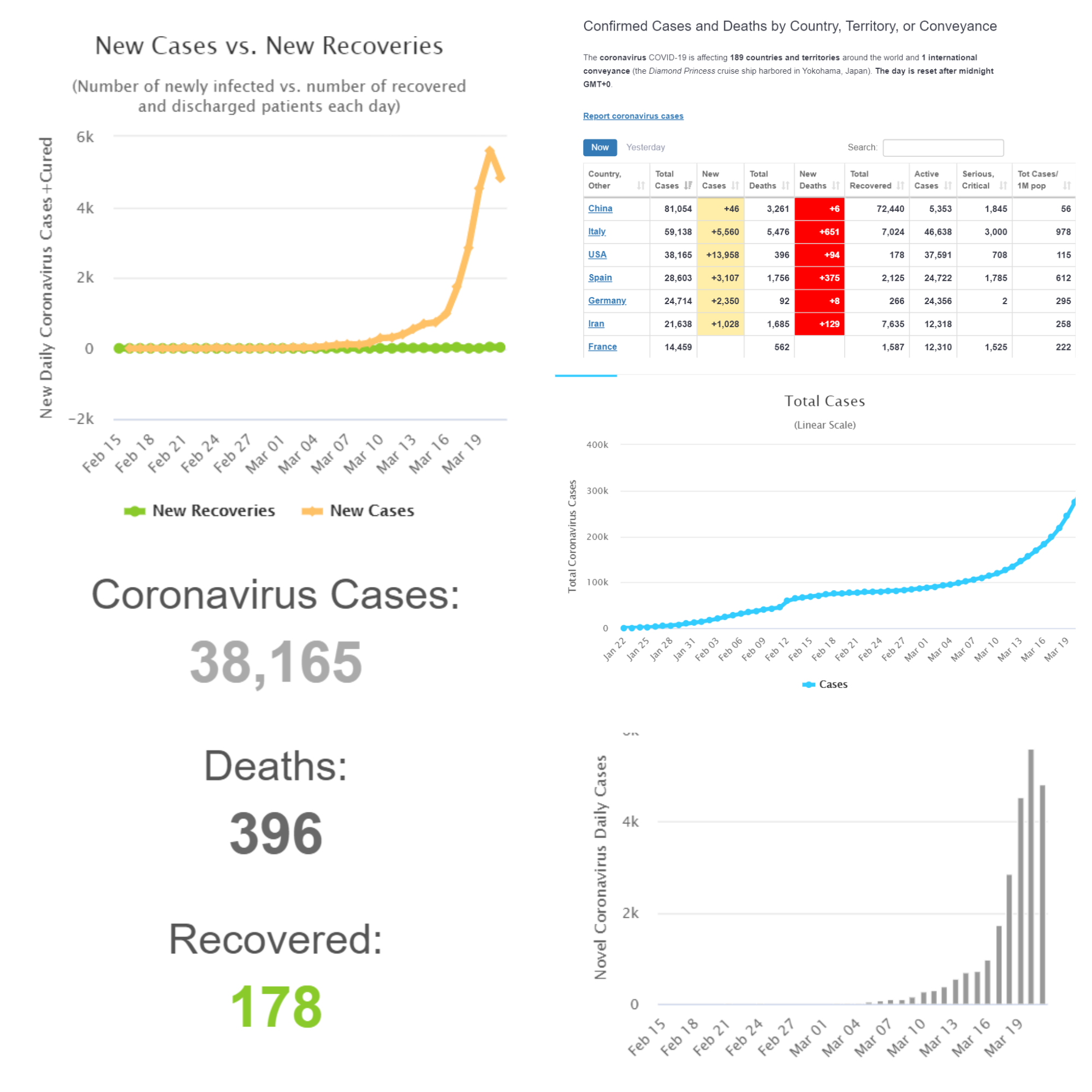
If you're a data enthusiast, this dynamically updating marvel of analytics is the site for you. This tool is designed to track the spread of the coronavirus across geographic regions over time. The visualization provides detailed data about diagnoses, active cases, chronological timelines, and statistical trends.
The site loads with a geospatial visualization of the virus's current impact and spread, framed by active charts, graphs, and real-time lists of statistics. Its churning chyrons and pulsating strings of numbers evoke imagery of the frantically throbbing queries of a NASDAQ stock ticker (but those line graphs would be trending in a different direction).
The online dashboard pulls official health data from the World Health Organization (WHO) and major countries' centers for disease control. Thanks to a graphic information system (GIS) powered by Esri, dull strings of numbers are visualized as elegant pulsating blobs expanding insatiably, while raw statistics become frantic line slopes ticking tirelessly towards an immortal destination.
Health Maps
-
"COVID-19" by Health Map, et al (University of Oxford, HealthMap, Harvard Medical School, Boston Children's Hospital, Northeastern University, Oxford Martin School, Tsinghua University, IHME)
-
Best Use of Storytelling Through Animation

(Courtesy of HealthMap.org) | Data Not Current
Worldometer
-
"COVID-19 Coronavirus Pandemic Tracker"
-
Fastest Real-time Updates
Run by researchers and volunteers, Worldometer is an apolitical organization that specializes in providing the latest, most up-to-date facts, figures, and statistics on the state of the world in real-time. Its data experts have adapted this mission to tracking the spread of the coronavirus. If you're looking for hard numbers, daily trends, and lots of line graphs, this is the site for you.
The site is updated constantly throughout the day from sources including the World Health Organization (WHO)'s Novel Coronavirus (2019-nCoV) Situation Reports, the Centers for Disease Control (CDC)'s 19 Novel Coronavirus (2019-nCoV) in the U.S., and an amalgamation of breaking news resources.
You can filter the page scope by region. On the page for the United States, it displays logarithmic graphs for total infected, total active cases, and total covered. It also displays cases by day and by state, with new cases and new deaths indicated. It also updates with daily summaries, including any major news developments (i.e.. "23 million Americans on lockdown after XXX; first death in XXX county, a woman in her 50s with underlying health conditions," etc).
It's a great way to dilute, summarize, and simplify the barrage of news overload into the basic facts that matter most. It's crisis coverage curated into what you actually need to know, in the numbers, with no spin.
Tableau Data Hub
-
"COVID-19 Data Hub Curated Maps"
-
Most Elegant User Interface
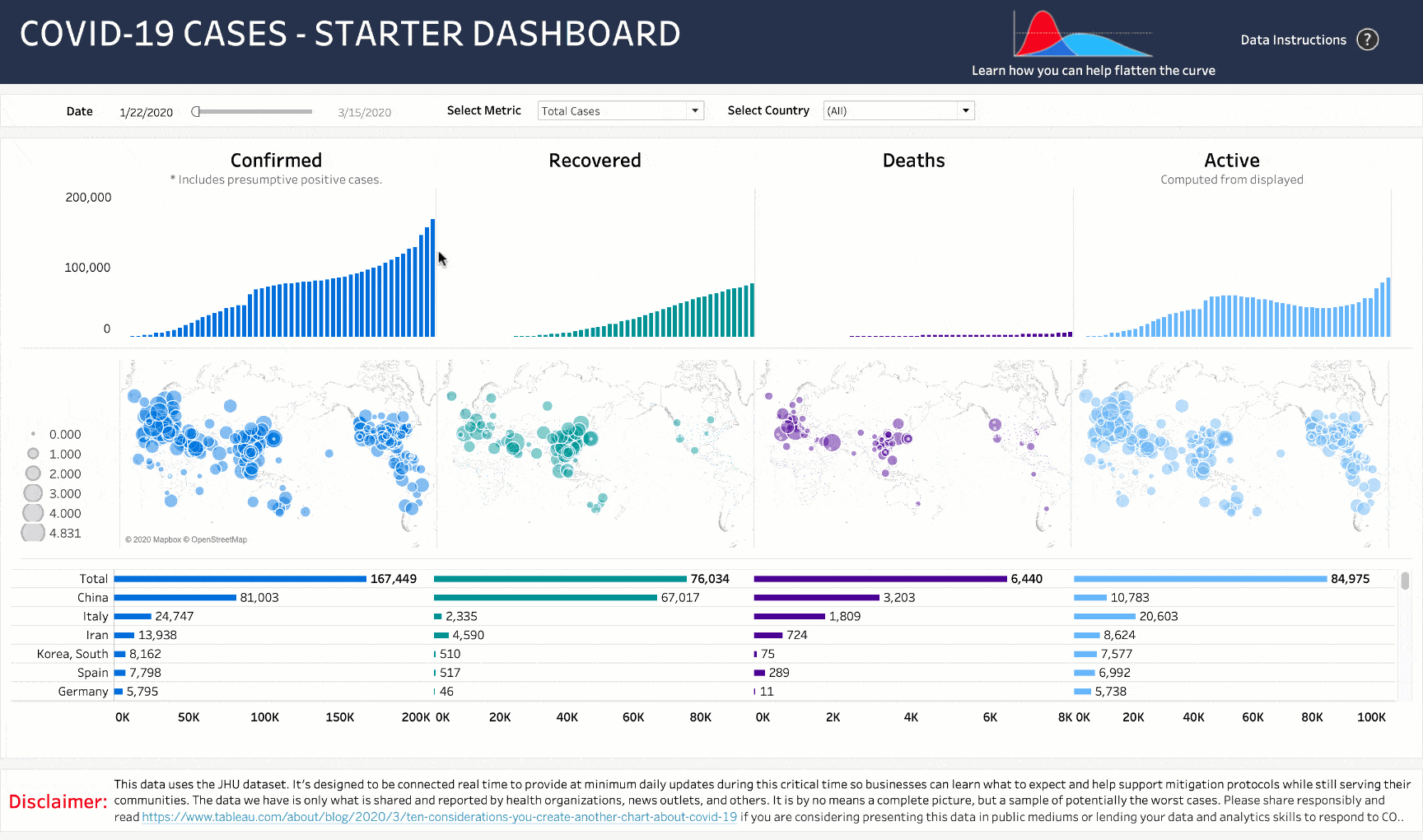
This map (dashboard) found via Tableau pulls data from the nCoV2019 dataset, visualizes it, and lets you play with it through this interactive dashboard. While slow-to-load, its elegant user interface is responsive on-page and displays vast amounts of information in a way that's organized to be both intuitive and clear.
The New York Times
-
"Coronavirus Map: Tracking the Global Outbreak"
-
Best Contextual Display

This regularly-updating webpage has elegant maps interspersed with paragraphs of journalistic coverage. These data visualizations aren't interactive, but the numbers are actively updated every few hours. Beyond just the statistics, this site does an excellent job explaining what these facts, figures, and news events actually mean in context.
Covid19.HealthData.org
-
"COVID-19 projections assuming full social distancing through May 2020"

Unlike the other maps on this list, this tracker visualizes projections for the outbreak based on full social distancing, and how these hypothetical timelines compare with the resources we have and the resources we'll need. This tracker doesn't do much, but it does allow you to filter by state and locality, calculating "peak resource use" date based on existing trends in the rate of transmission and the quantity of ICU beds, ventilators, and hospital beds states currently have available. While they are not doctrine, these projections are interesting and shed light into the tools our officials are using to plot the trajectory of this public health crisis.
Bloomberg
- "Tracking the Spread of the Coronavirus Outbreak in the U.S."

These tools help us simplify, organize, and consume effectively the vast overabundance of rapidly evolving data with real-world consequences. With the power of data visualizations, not only can we synthesize our questions with the girth of the facts, refine our questions with sharp granularity, and understand trends as they emerge in real-time. In this culturally significant moment when time is scarce and need is urgent for millions of healthcare professionals and government officials around the world, it's more important than ever to have accurate, up-to-date information organized in such a way that it helps us solve problems and analyze big questions.
Where do you go for updates on the coronavirus outbreak? Share your favorite sites and sources with us.